
 Screenprinting Equipment From Catspit Productions


Learn How To Screen Print With Catspit Productions, LLC
Plastisol Ink Mixing & Color Theory
Check out the Article Archive for great screen printing articles!!
Here is a link to an article by Mike Ukena on screenweb.com about plastisol ink management and using additives. This is a great introductory article covering a good range of useful information about plastisol ink usage. Copyright © 2009 ST Media Group International. All Rights Reserved.
Pointers for Managing Your Plastisol Inventory
General Theory Of Subtractive Color
 Subtractive color theory is that of mixing inks, paints, dyes or other natural pigments to make colors which absorb and reflect particular wavelengths of light. When you see a red box, you are actually seeing the red light being reflected off the object, meaning that the object reflects the red wavelength in the electromagnetic spectrum and absorbs all the others. So even though we add inks together we are subtracting reflected light, hence, subtractive color because we see the reflected color not being absorbed or subtracted.
Color could be said to be absolute if we are referring to the electromagnetic spectrum and the particular wavelength associated with each color of light. But when it comes to human perception, which is ultimately most important, color is not absolute. Each of us perceives color differently. This is something that is good to keeping mind when dealing with customers in screen printing.
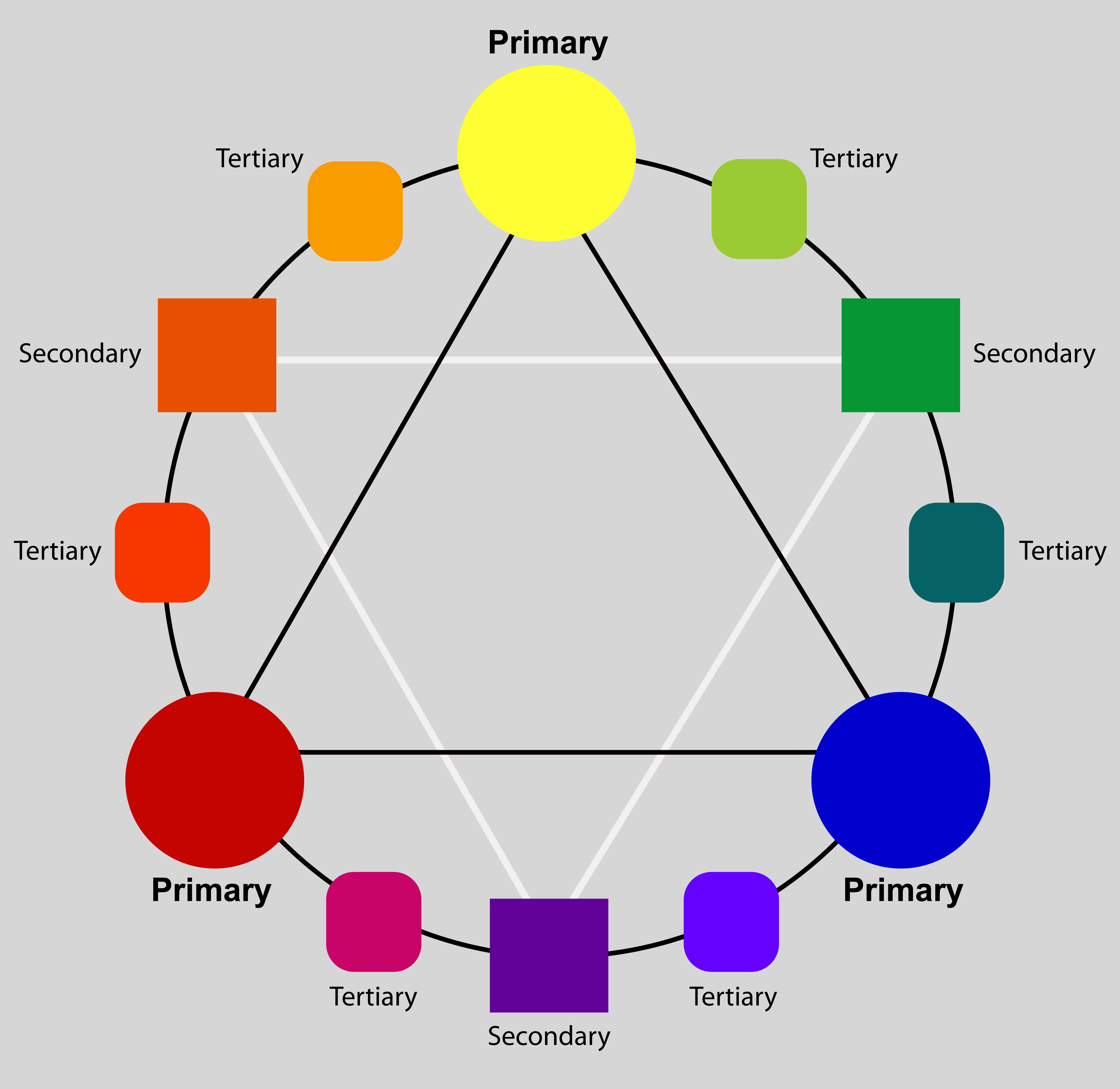
In basic color theory where we mix paint for painting via the brush, we use the 3 primary colors; red, yellow, and blue. We can mix these 3 colors to mix any of the secondary or tertiary colors in the color wheel. This is more about what color is being reflected in the end.
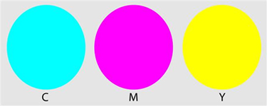
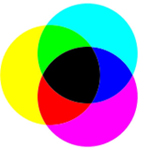
In printing we use cyan, magenta, and yellow as the primaries. Black is added for various reasons most importantly because cyan, magenta, and yellow do not produce a "pure" black. This is called four color process, process color or CMYK. K represents black. This system is based on what light is being absorbed. This is so that the amount of any color showing in the final print will depend on the amount of ink laid down for each or the 3 primary colors. Cyan is the opposite of red. Magenta is the opposite of green. Yellow is the opposite of blue. The amount of blue in the final print will be directly related to the amount of yellow ink that is printed. The same is the case for the other primaries respectively.
Here is a link to the color wheel above. Feel free to print it out or copy and save it in order to work with it when mixing inks - Color Wheel
Some General Tips On Mixing Plastisol Inks
Mixing plastisol inks can be an easy way to create a particular color that you don't stock already. Perhaps you need a burnt orange for a 2 dozen shirt order. Now burnt orange is probably not a color you may use often. So in this case it is perfect for mixing the color needed for the job.
Orange is a common color to stock and if you have any "regular orange", you can start with that. If not, you can add equal amounts of red and yellow. Using more yellow will create a lighter orange. Using more red will make a red orange. Once you have the base orange you want to start with, add some black or even brown to make a burnt orange. If you use brown it will be a warmer, dirty burnt orange. If you use black it will be a cleaner darker burnt orange. Be careful when adding black ink to any other color. Use very small amounts and add more as needed. Black is very powerful and can overwhelm your color before you realize it.
White can be added to most any color to create a pastel or light shades. Adding white to blue will make light blue all the way to powder blue. With red, adding white will make pink or rose. White is also a color you should be careful with when adding to another color. Make sure to mix the ink thoroughly between additions of white. White can take some time to mix through but it is weak in comparison to adding black to other inks.
Depending on how light you intend to go, you may want to start with a volume of white ink and add the color to that. Sometimes trying to lighten a color by adding white ink will make you end up with more ink than you need.
It is best to mix your plastisol ink for screen printing on a non absorbent surface. If you use something like a piece of cardboard, over time the ink will solidify due to the absorption of its constituents into the cardboard fibers. This can happen as quickly as a few hours to overnight. I use an 11 X 14 piece of Plexiglas to mix small amounts of ink. For larger quantities, you may wish to use mixing cups or buckets of various sizes.
It is suggestest that you use plastic or metal spatulas and mixing sticks. Wood sticks like the ones used for painting are very absorbent and can leave wood fiber debris in your ink. You can use plastic or metal tools for applying the ink to your screen as well. Just make sure there are no sharp, square edges that could puncture your mesh accidentally.
Mixing ink can be a cost effective way to supplement the color spectrum of your ink stock. However, if you do it in excess you can end up wasting ink. The best general rule is use ink straight out of the bucket as often as possible. Avoid mixing ink unless you are buying into a sophisticated computerized software system. That is the best way to make ink mixing economical and practical. Ink mixing software based on volume or weight is the most efficient ink mixing tool. Many ink vendors offer ink mixing software for use with a particular line of their ink.
The following is a list of links to other ink mixing articles in the Article Archive section of this website. Please click on an article title to go to the article page.
Common Plastisol Ink Additives
Mixing Color Plastisol Inks: Creating Basic Colors